eCycle: Bike rental
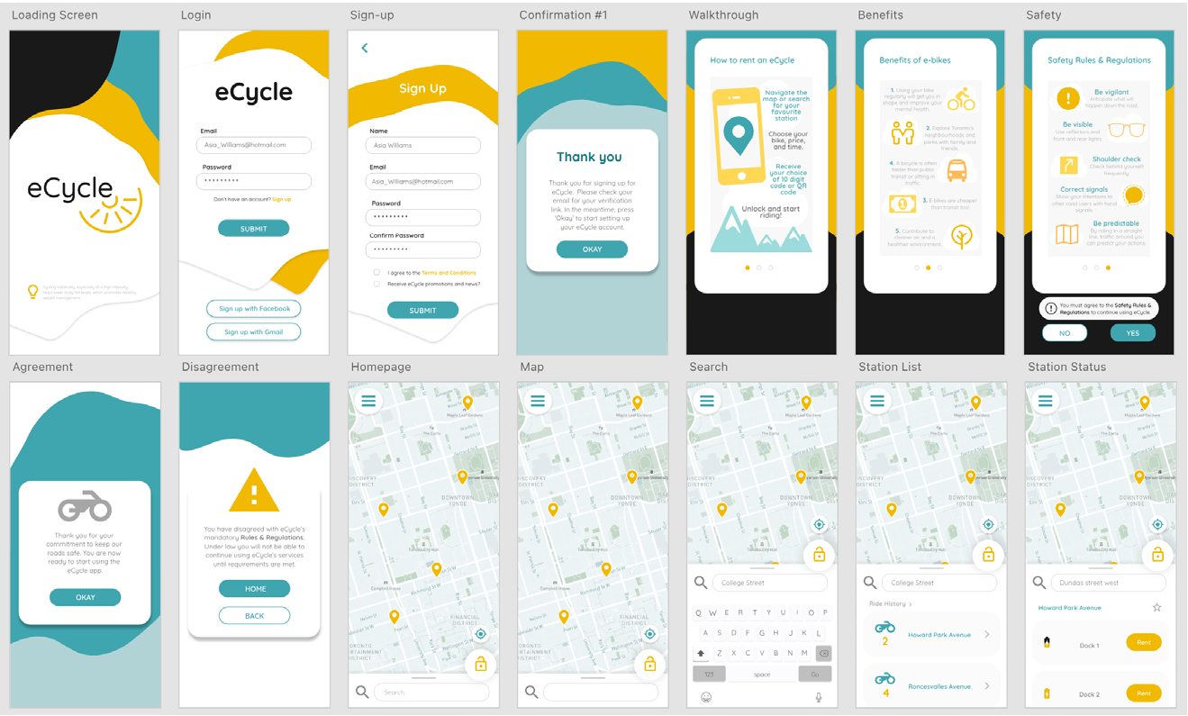
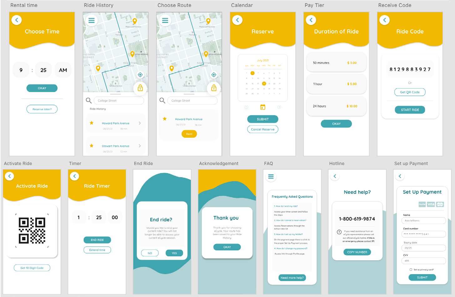
A case study for a purposed Canadian based company called eCycle, this app will allow users to conveniently rent an electronic bike from the nearest eCycle docking station as an alternative and green form of public transportation. eCycle's main goals are safety, health, and convenience. With a simplistic yet informative interface the app will allow users to view their best rental options from a map view or list, and rent an electronic bike for their desired time duration. Users will be able to unlock their rental with a simple 10-digit code and start riding immediately.
Project Details
- Date: March 2021 - May 2021
- Roles: UX Research & Analysis, Branding, Wireframing, Prototyping, Storyboarding
- Programs: XD, Procreate, Photoshop, Illustrator, InDesign
- Team: Solo project
The Problem
As electronic rental bikes have started to become a more popular transit option in Canadian cities, the need for a more convenient way to rent has also grown. Currently no app exists for eCycle so users must go to a physical docking station in order to rent a bike. Ideally, an app rollout will allow eCycle users to be able to plan, book, and rent their bicycles virtually in a much more advantageous process giving them options and new ways to utilise eCycle’s services.
The Solution
The eCycle app will offer a streamline process when choosing to rent a bike for whatever a user's purpose. By searching for the station closest to a user's location, the app will show bikes available beforehand and allow users to reserve one for up to an hour before departure. With varying rental lengths at different prices the user will never have to commit more rental time than needed. With these goals in mind the user will have all the information needed to have a booking experience that works for them.
Competitive Analysis
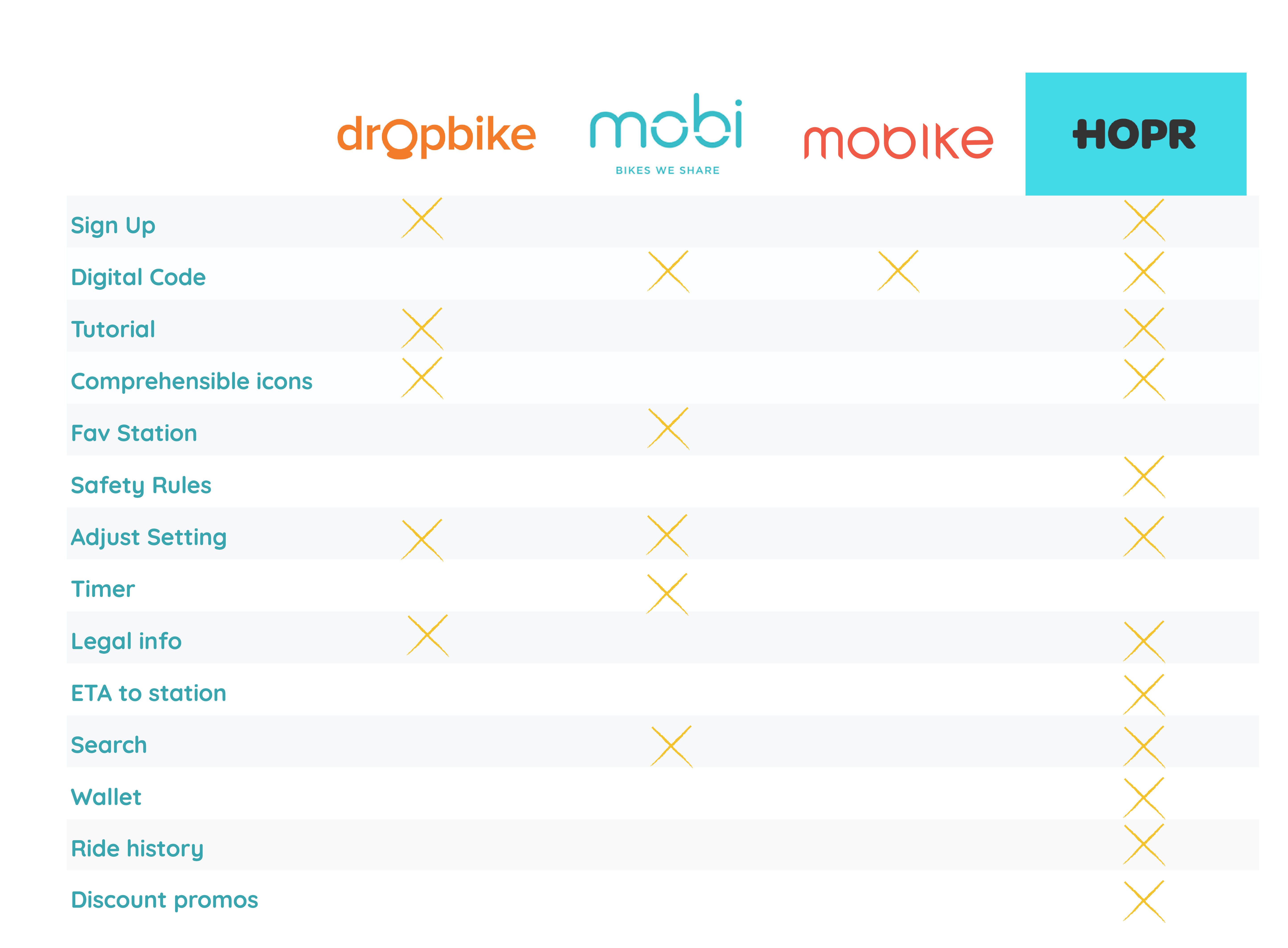
Browsing through various competitors apps has informed me on design decisions to avoid; such as having a purely GPS based search function as this is not convenient if you’re in a different part of the country, but are planning a bike transit based vacation elsewhere. It will also be important to avoid using unclear iconography to indicate different eCycle station statuses. However, keeping the UI too simplistic is also a detriment as the user may be unsure on how to interact with the app with UI is triggered based soley on user interactions.
User Persona
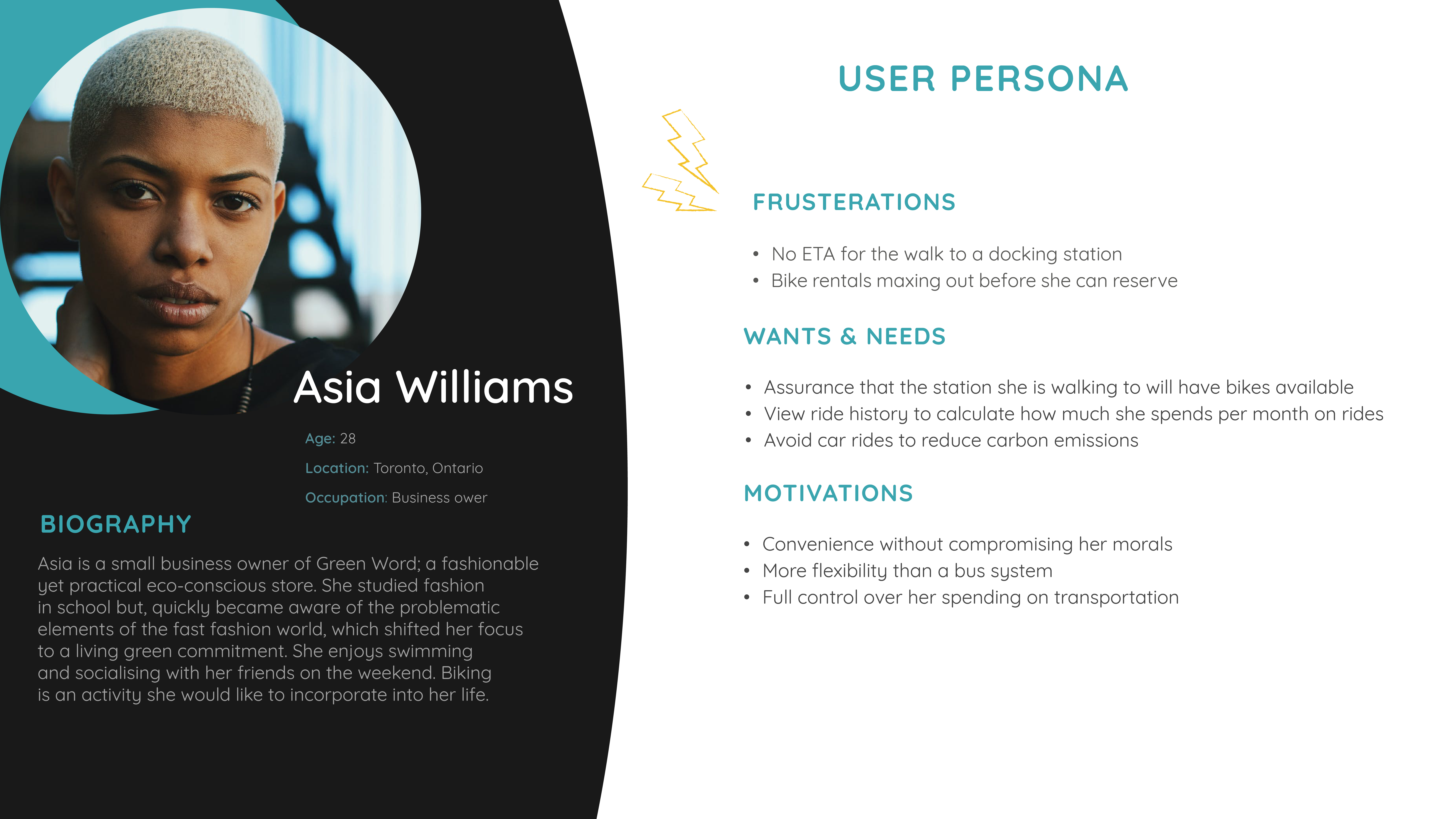
This persona profile informs me that this app will be used in ways outside of leisure and convenience. Going forward it will be important to consider if eCycle will be a frequent mode of transportation for the demographic and if it is, it might be benficial to add features such as “favourite station” or already preplanned routes for maximum convenience.
Storyboard
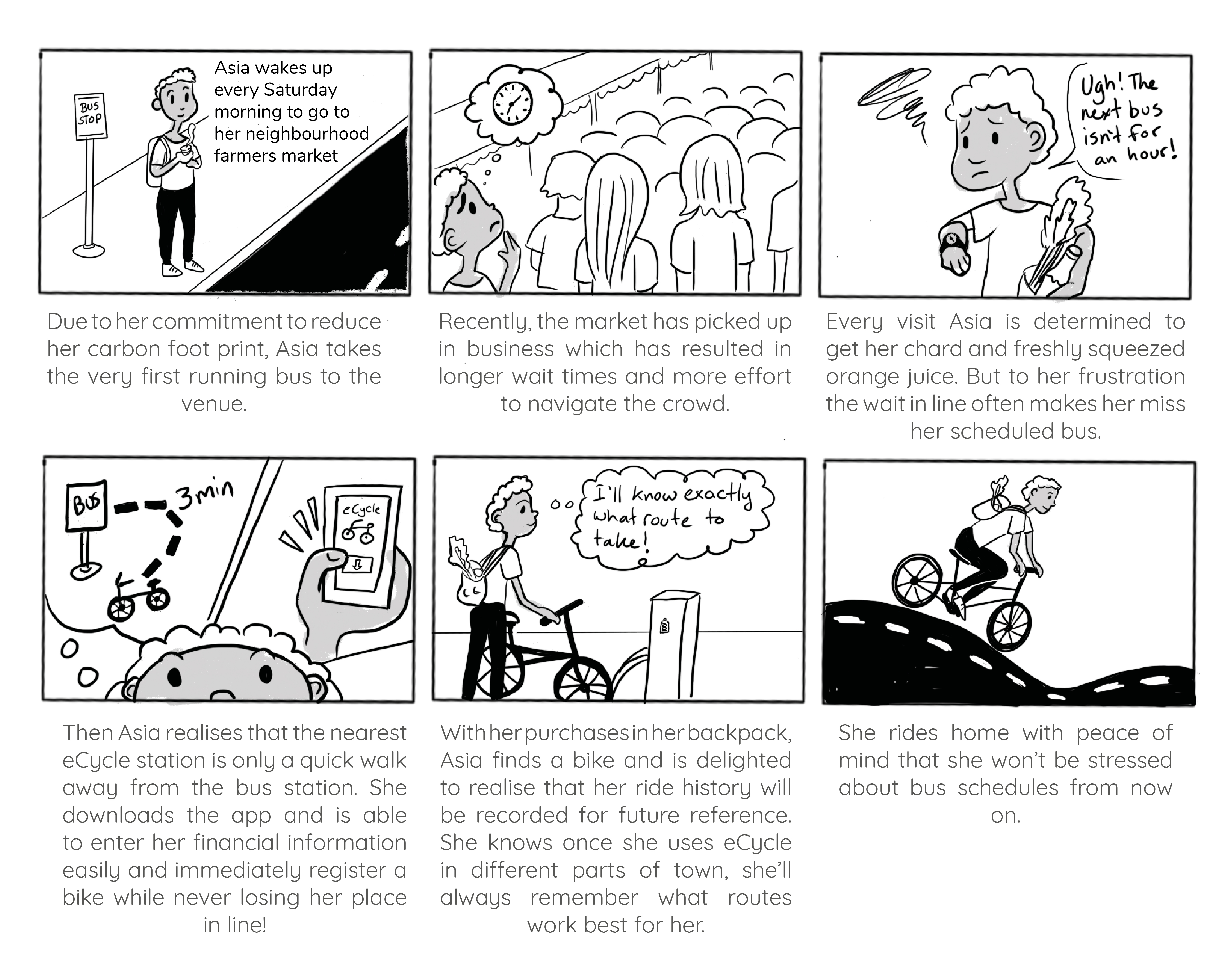
This storyboard was an exercise in imagining a realistic situation that has little to do with the app experience to begin with, but under the right circumstances it could be the answer to a problem. Walking through Asia’s experience, I thought that elements like baskets on the eCycles might be a worthy investment for the company in the future, now that I realise that some people might use eCycle to help with shopping or possibly business.
Userflow Diagram
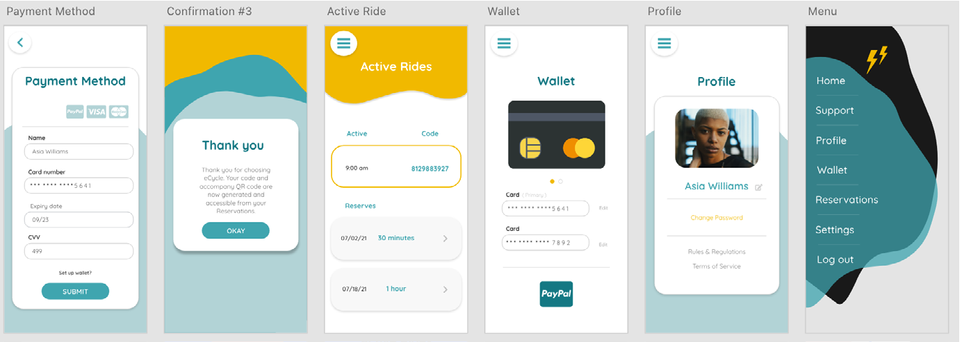
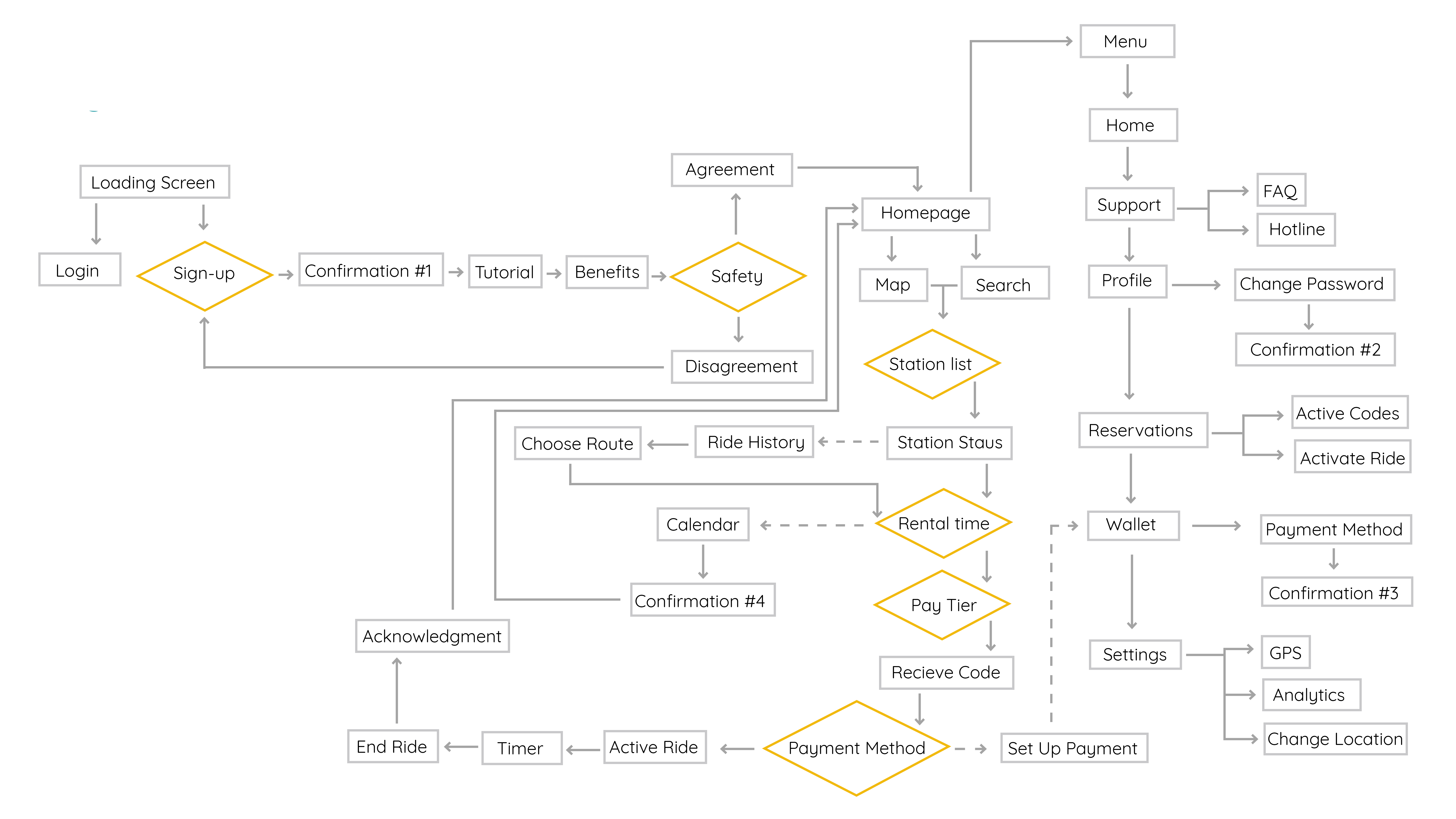
The userflow has informed me that slide out menus would be the most efficient way to design this app. A hamburger menu will be necessary to access screens that would need to be frequently checked (such as reservations and credit card payment). It will also be important to consider how eCycle will deal with customers who decline to agree with safety rules.
Brand Guide
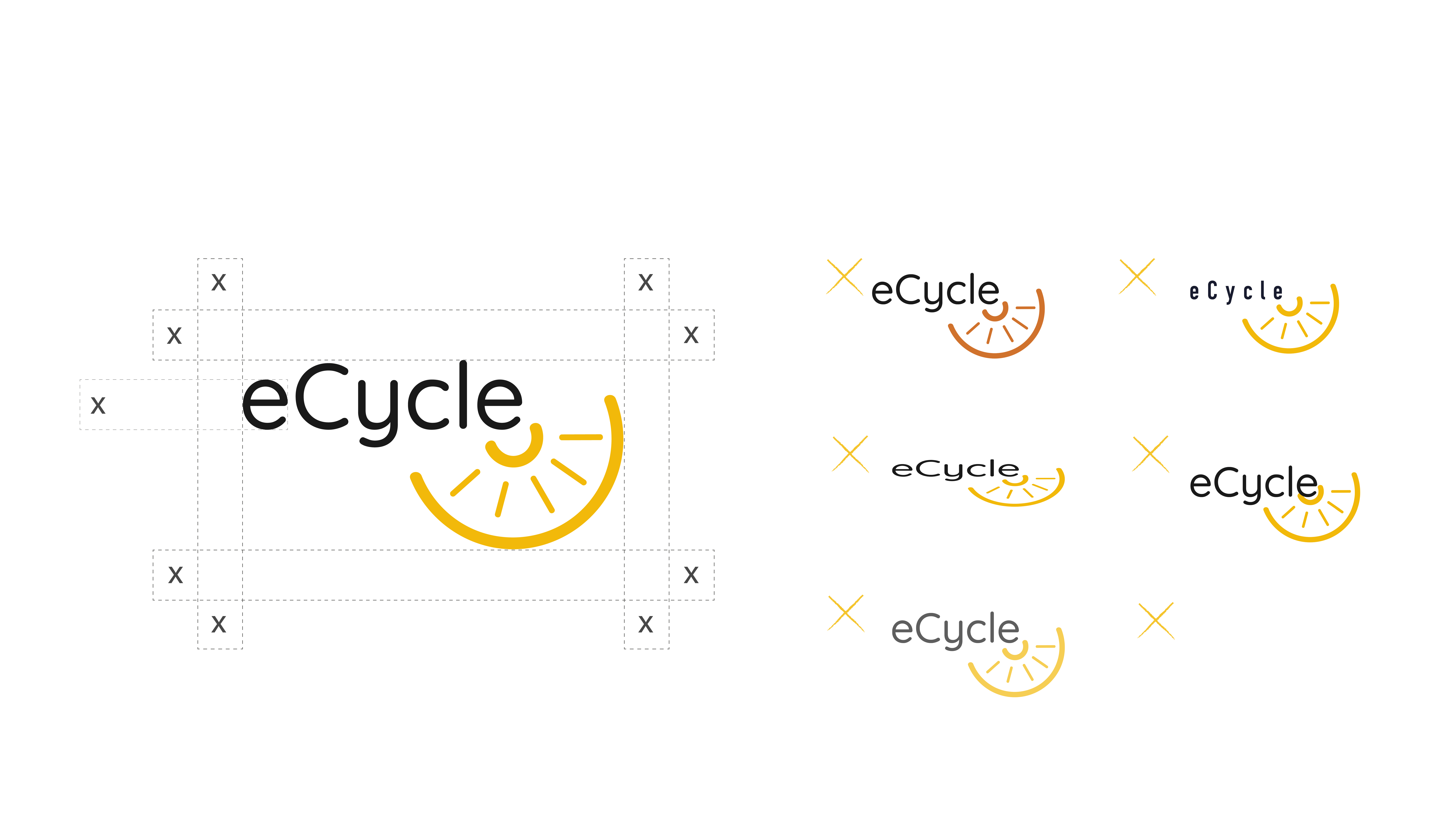
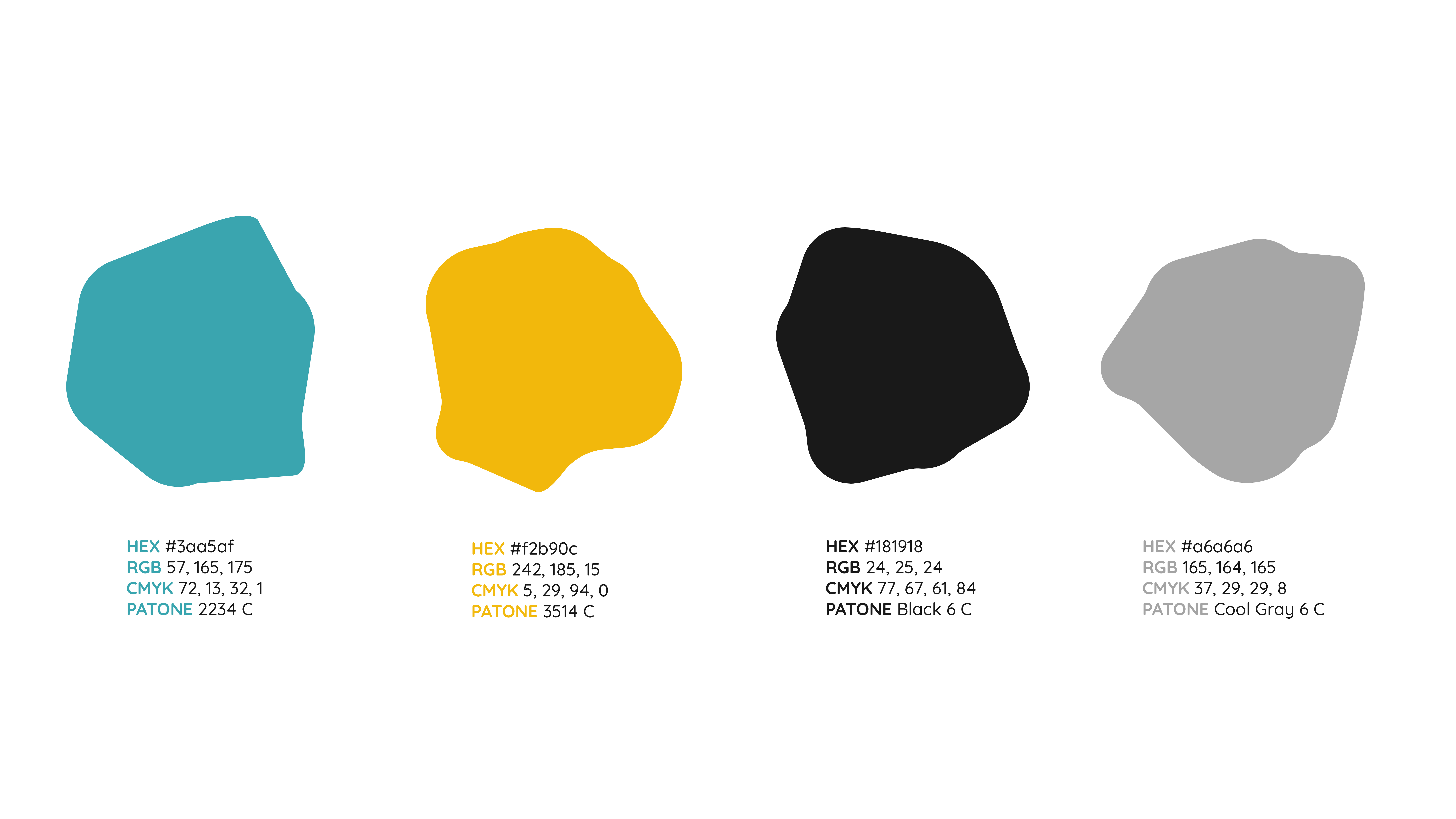
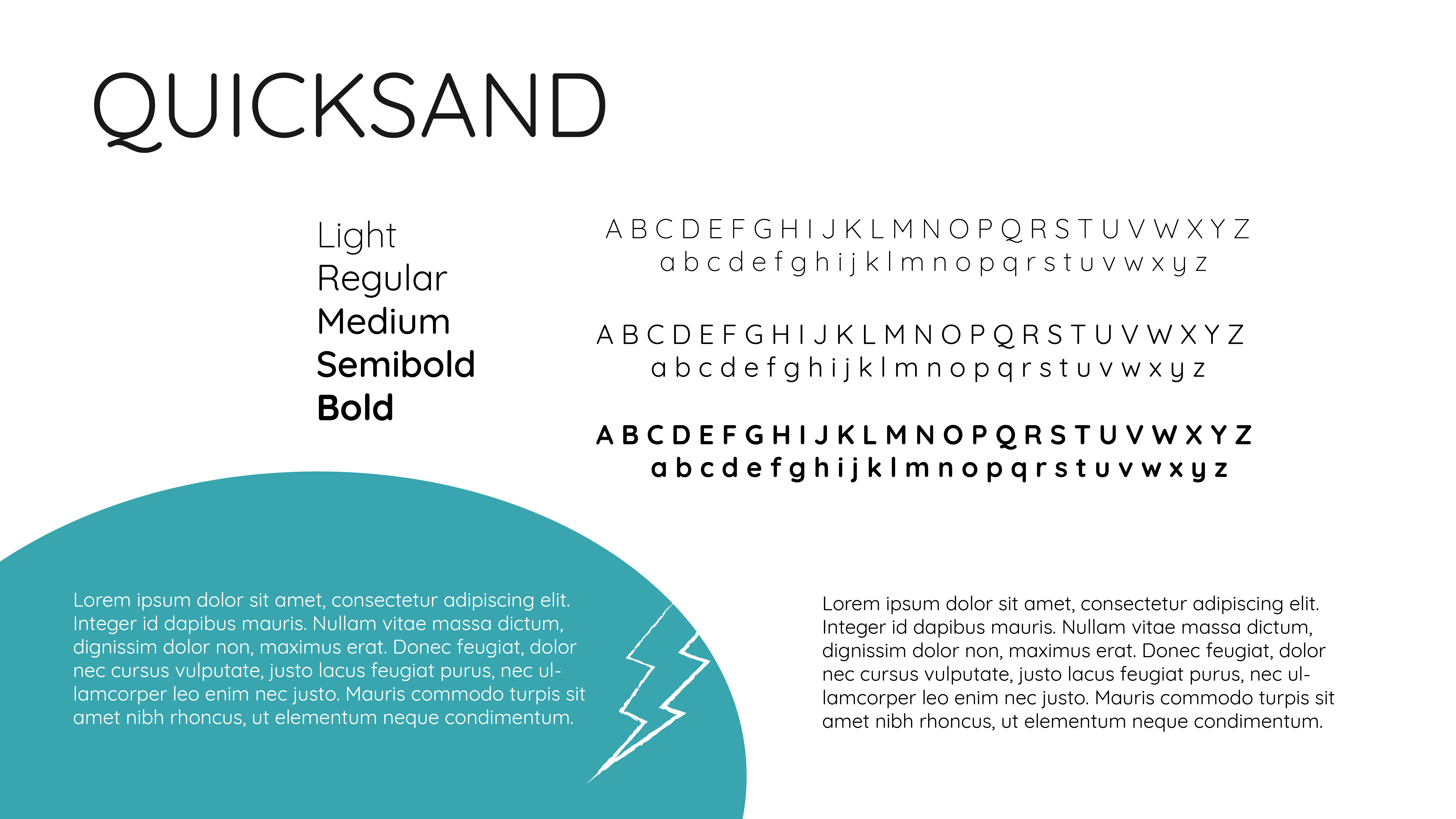
The branding for eCycle was chosen specifically with their demographic in mind. I chose yellow and teal to provide emphasis on the “electric” aspect of the eCycle brand. These colours reflect a futuristic association that many young working professionals and college students are familiar with seeing in their sci-fi themed media. The grunge aspect is to reflect the counterculture aspect of biking as transportation, so the eCycle logo was chosen to specifically reference a bike itself. The typography is a clean and modern type so the brand can evolve past the current branding if needed.
Logo
Clear Space & Integrity
Brand Colours
Typography
Wireframes
Sketches
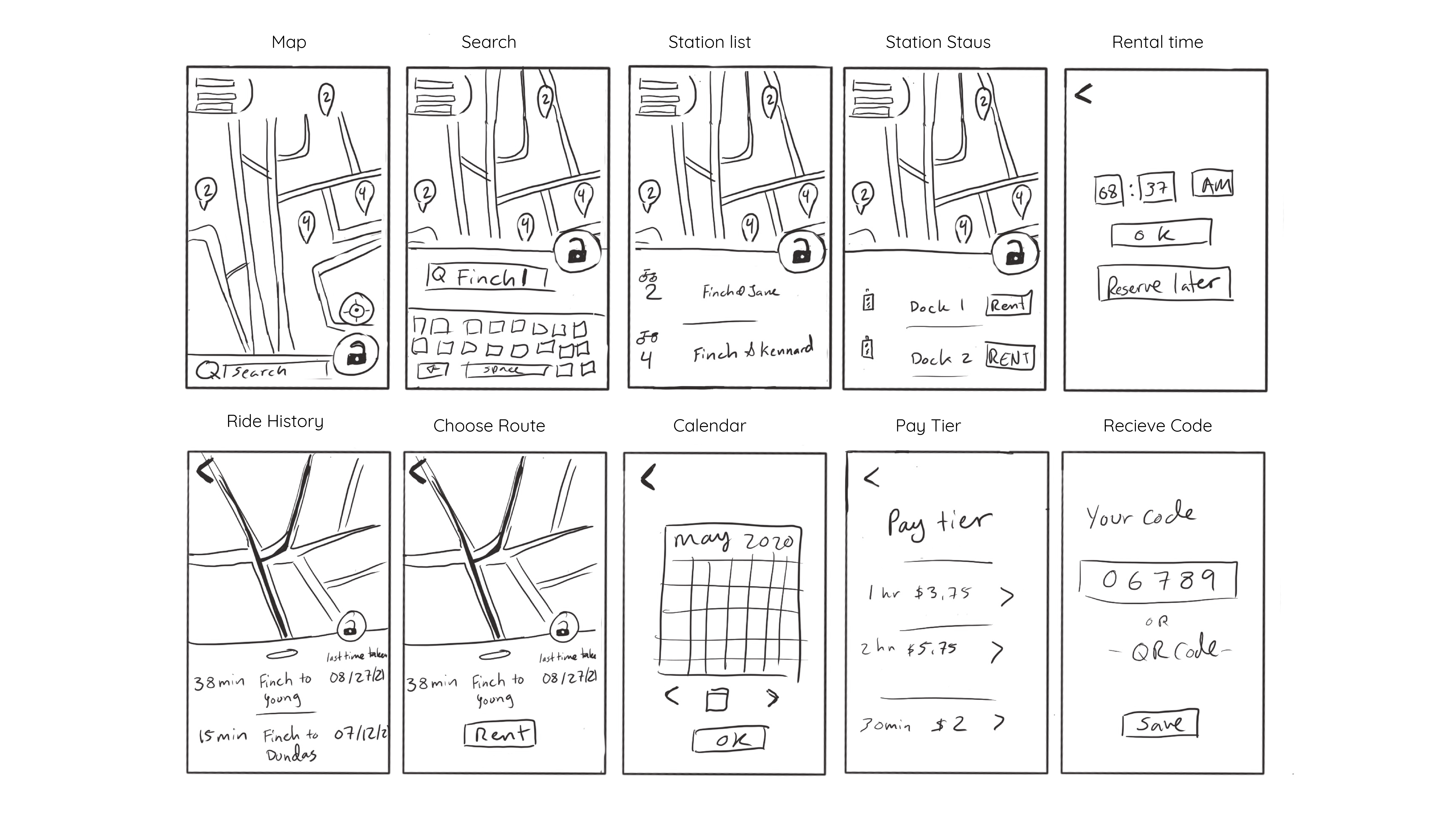
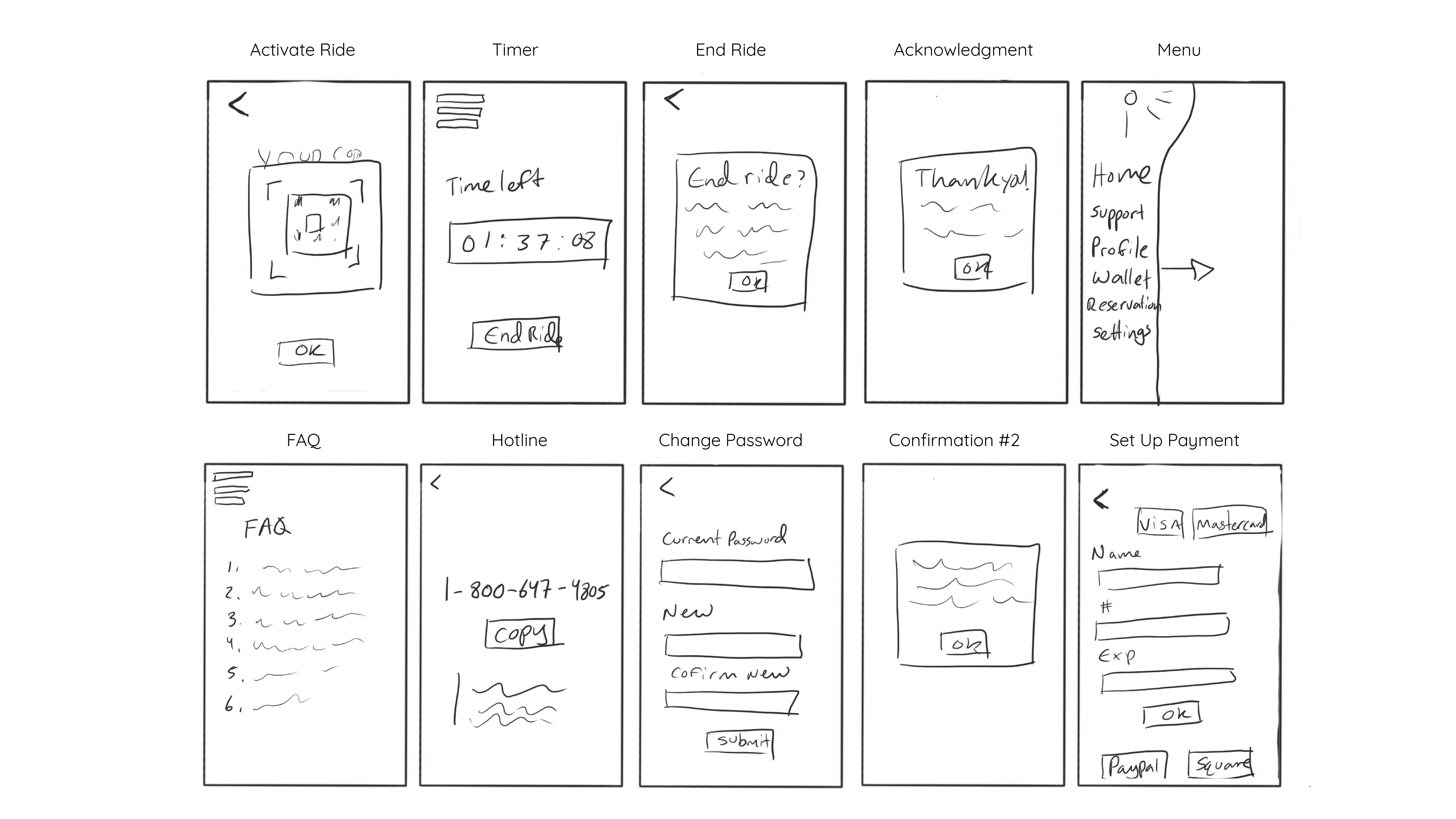
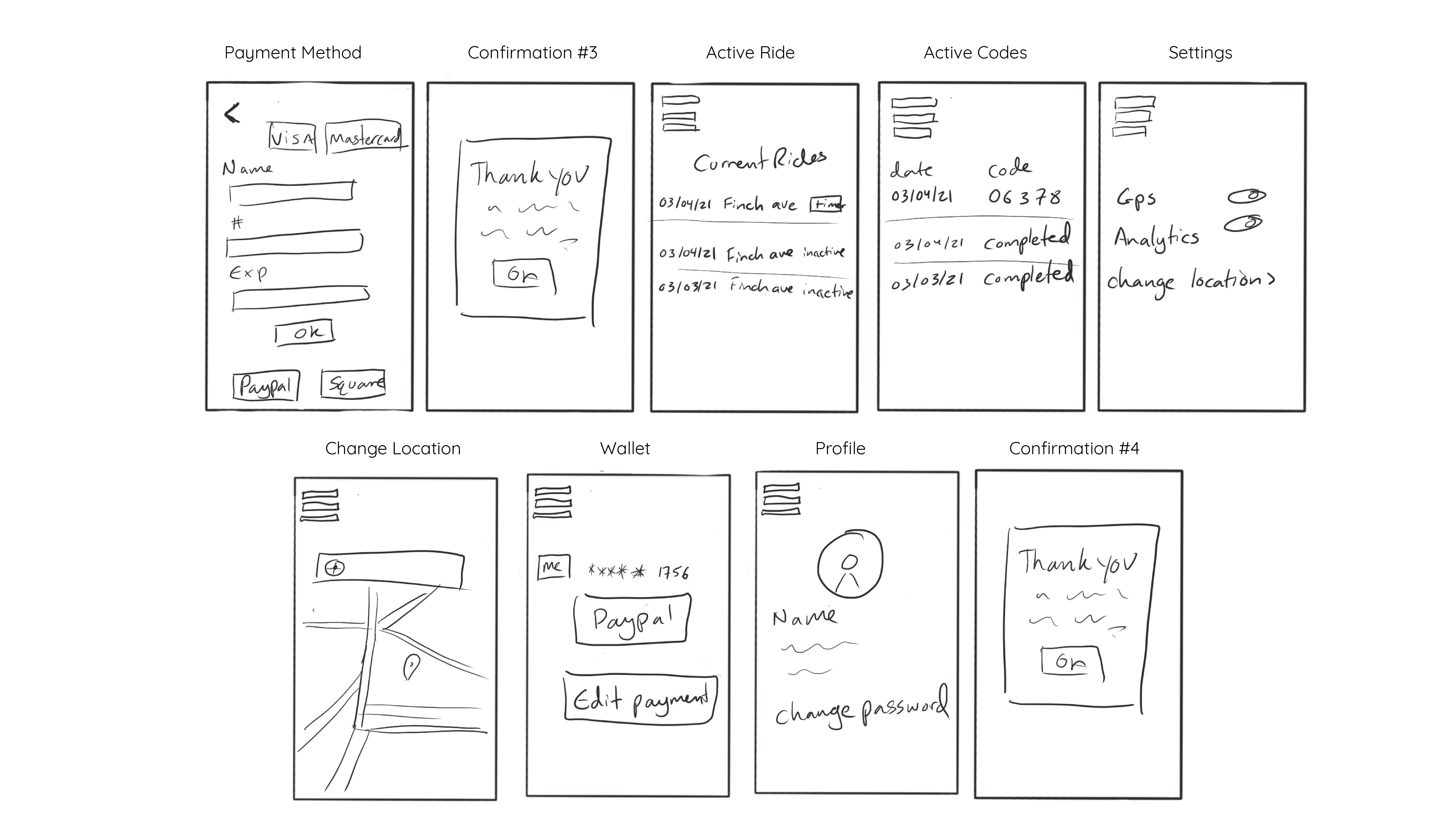
Lo-Fidelity Wireframes

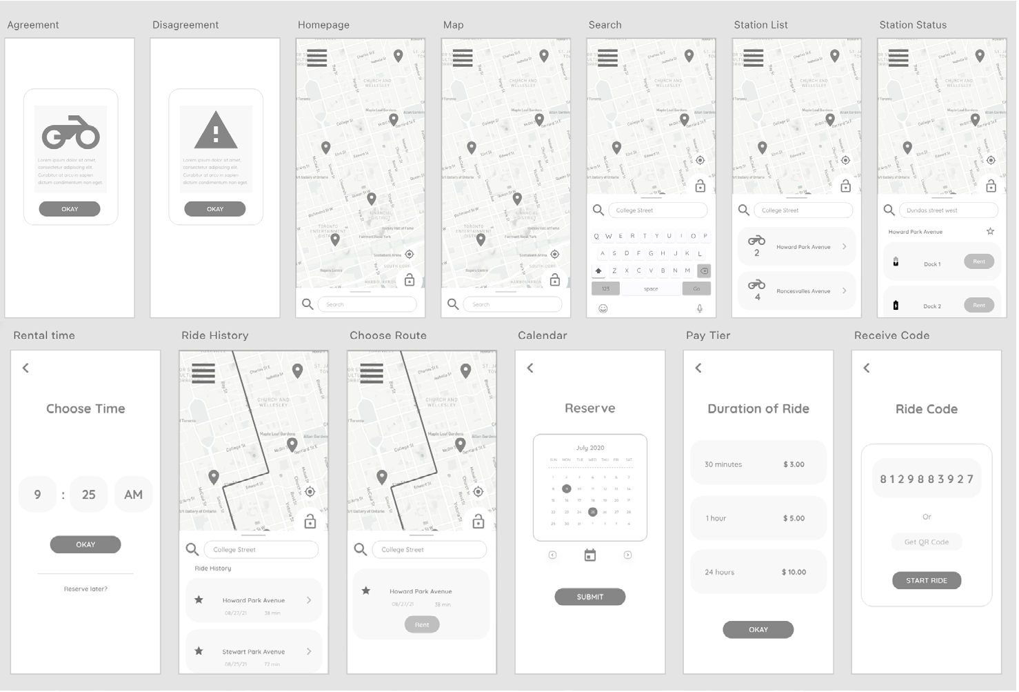
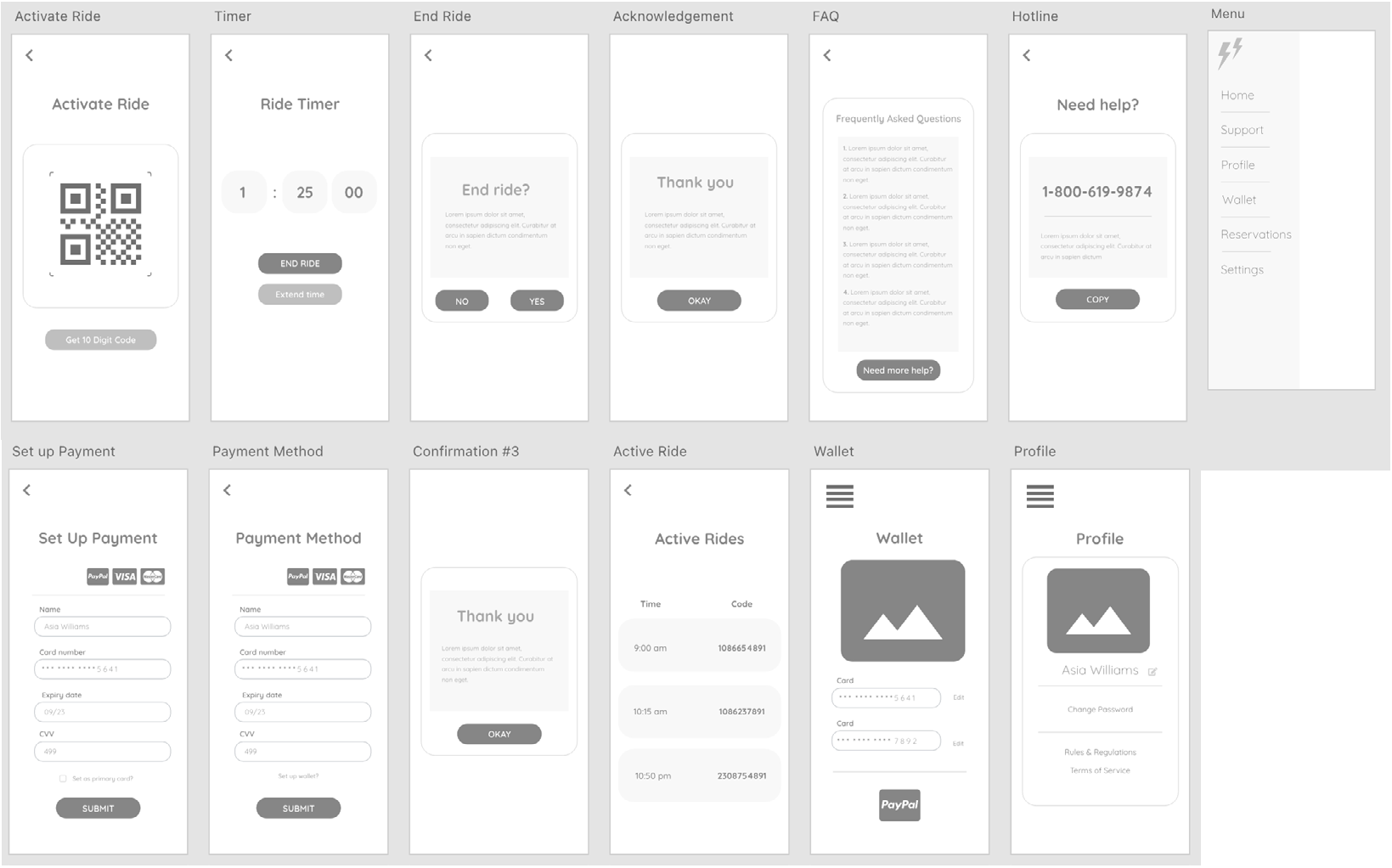
Hi-Fidelity Wireframes
