Metrolinx: Reloading PRESTO
Originally done as a personal project, I decided to review and audit PRESTO's onboarding and card reload userflow, after encountering several pain points as an iPhone user.
This case study will review the early 2020 Metrolinx's PRESTO card reloading userflow. I will examine scenarios and alternative methods to implement better accessibility on PRESTO platforms, and to create a more consistent experience amongst all users.
Project Details
- Date: March 2021 - May 2021
- Roles: UX Research & Analysis, UX Auditing, Branding, UI Design
- Programs: XD, Procreate, Photoshop
- Team: Solo project
Introduction
PRESTO is a contactless, smart card automated fare collection program funded by an Ontario government funded organisation; Metrolinx. They were commissioned by the Toronto Transit Commision in 2006 to create a system that would allow the TTC to phase out the use of tokens and monthly metro passes into reloadable cards following the examples of London and Hong Kong’s transit passes. The project met criticisms as software and hardware glitches created extended contracts and nearly $3.4M in revenue loss. There have also been reports of breaches in customer’s privacy in regards to the law, with PRESTO providing law enforcements data, without customer knowledge 22% of the time, as well as a prolific incident with customer Samantha Chong-Luke where she was charged $240 in dodging fees, because she was unable to confirm if funds were successfully loaded on to her card. PRESTO cards are currently used within the Greater Toronto Area, Hamilton, and Ottawa.
The Problem Statement
The inital problem that is often encountered with PRESTO comes from the onboarding process on how to use PRESTO services. First time users and long time users alike have difficulty navigating the constant flux of updates, changing policies, and disorganised information presented to them, as well as the inconsistent means to which they can add money to their card. In turn information on PRESTO and how it relates to the accompanying app and TTC affiliation are not easily accessible and in turn can cause users to get lost in navigating pages and miss crucial information on how to use their card.
Why this Problem?
Data shows that 48% of Torontonians who are currently in the workforce use the TTC during their week. Presently, there is a gap between the theoretical function of PRESTO as 40% of the operational services commissioned by Metrolinx have yet to be delivered to the TTC. On each platform that PRESTO services are available (website, app, in-person), have a very different user experience and varying levels of ease and success. As a result, PRESTOs services often feel disjointed and can give the impression that the user is experience a BETA version of the project rather than a meaningful payment system of a world class subway system. There is also the very confusing dissonance of PRESTO and TTC being two different entities. Neither website shares information on the other, and even the branding is polar opposite colours and aesthetics. While this seems superficial, from a non-English speaking tourists perception is may give off the impression that the two companies are independent from each other which can cause confusion.
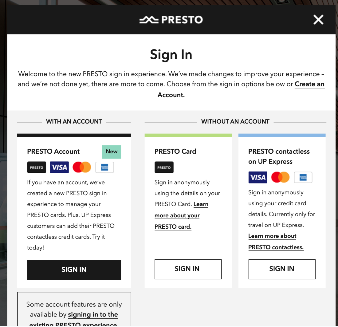
An early 2020 view of the online PRESTO card landing page. The user is presented with three different options when logging on to reload their PRESTO card.
Pain Points
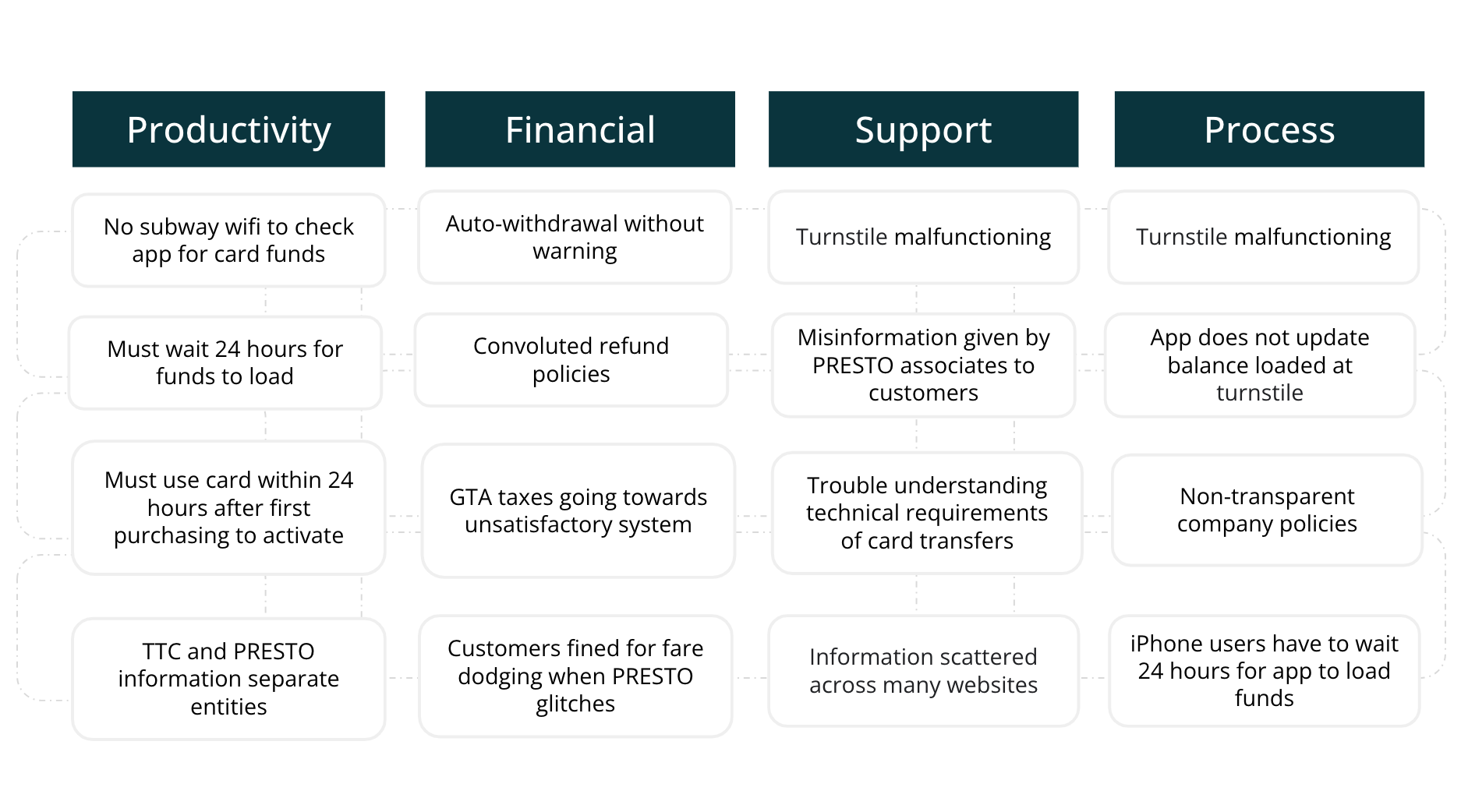
A chart highlighting the different pain points that PRESTO users have experienced with the current system.
Supporting Information
Demographic
Frequency of Use
- Torontonians regularly using the TTC: 48%
- Every day users: 23%
- Varied times throughout the week users: 25%
Age & Gender Brackets
- Women: 53%
- 18 – 34: 66%
- 35 – 54: 53%
Financial Factors
- Users who are employed: 58%
- Users who rent: 58%
- Homeowners: 41%
- University graduates: 52%
Geographically
- Downtown: 59%
- York/East York: 59%
- North York: 48%
- Scarborough: 38%
- Etobicoke: 37%
Insights
- At least 40% of TTC’s contracted deliverables not yet fulfilled by Metrolinx, according to TTC reports
- 7 years since the initial contract was signed and Service Level Agreement not yet agreed upon or signed
- TTC’s estimates that $3.4M of revenue have been lost in 2018 from malfunctioning PRESTO fare equipment
- Average of 60 days before information is purged from PRESTO card reader monitoring software tool
- Average of 7 days before encrypted device level data purged (not currently made available to TTC)
- Currently 15 complaints have been open to date with Better Business Bureau (7 counts for billing errors and 8 for overall services)
- Metrolinx has not reported full revenue earnings leading to distrust with their customer base.
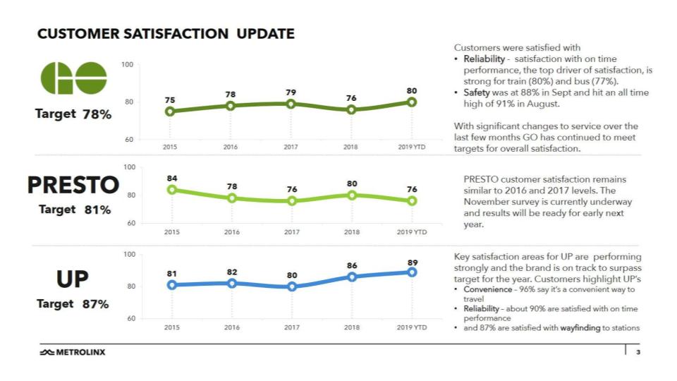
Metrolinx pledged to have a 81% customer satisfaction score by 2019 but did not meet this goal according to the Metrolinx provided graph
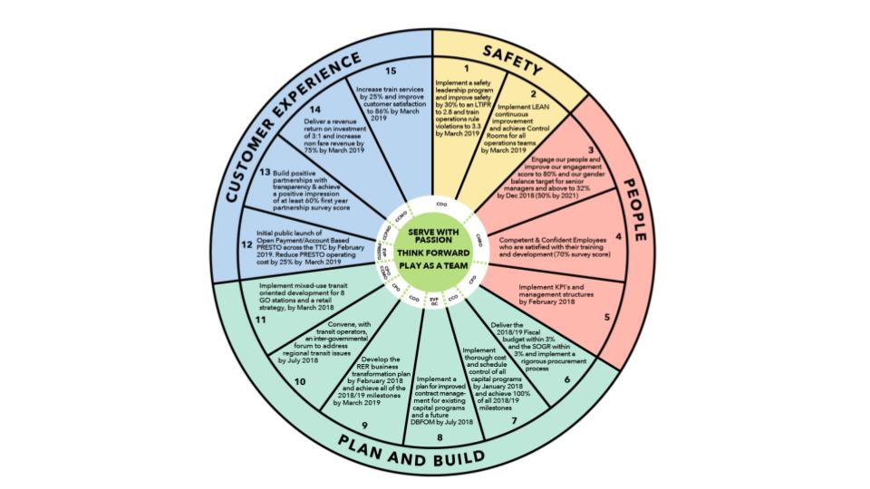
In their 2018 business report Metrolinx dedicated ⅓ of their yearly goal to customer service, which has not been achieved since.
User testimonials
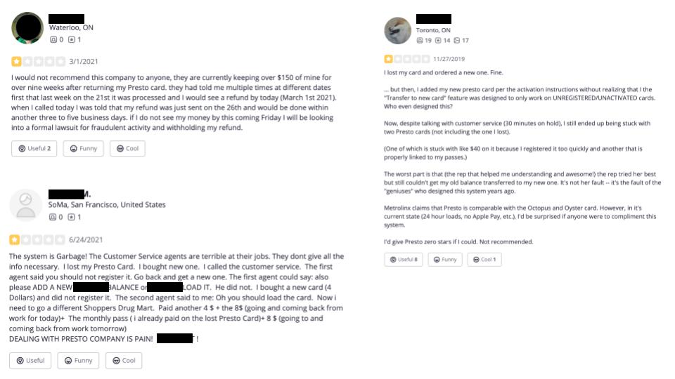
Average user scores: 3/5 Stars on Google. 2/5 Stars on Apple. 2.5/5 Stars on YELP!
Why This Issue is Important
PRESTO is modelled after London’s Oyster card and Hong Kong’s Octopus card, yet has failed to reach the same level of consistency and value for the product being presented as their competitors. Judging on the qualitative data gathered it seems that overall PRESTO customer base is dissatisfied with the unnecessary hurdles they need to jump through to achieve the convenience that PRESTO is trying to deliver. While this can be attributed to hardware and spending issues, the emotional state of the customer base is also important thing to consider. If customers feel like their concerns are being met, as well have proper support systems in place to deal with their PRESTO troubleshooting, they would feel more valued and therefore have a greater experience using PRESTO services. Right now there is a great sense of distrust and using PRESTO is a dreaded experience for many commuters. To change the onboarding process so it makes sense from the customer perspective and also install a feeling of a professionalism, it’s possible that when PRESTO technical issues arise that customers will feel more satisfied at the end of the process.
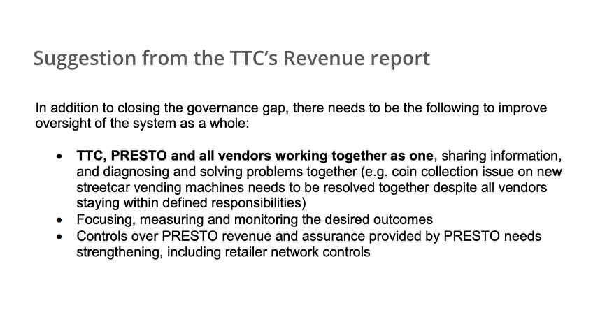
Suggestion from the TTC’s Revenue report on how to strengthen PRESTO services.
Competitors
I’ve chosen to compare the difference between the TTC and PRESTO to Montreal’s STM, London's Oyster Card, and Hong Kong's Octopus card. The homepages for the competing subway systems have an immediate cohesive look. There is information on the POP methods as well as general information about the subway and fare system itself. The front page has all the frequently sought after information laid out with graphics that will give clues to the user to which page they will need to navigate to. This is especially useful for someone using the website who may not speak the language presented on the website. There is no need to navigate away from the website to find all the information needed to plan a trip or reload your card.
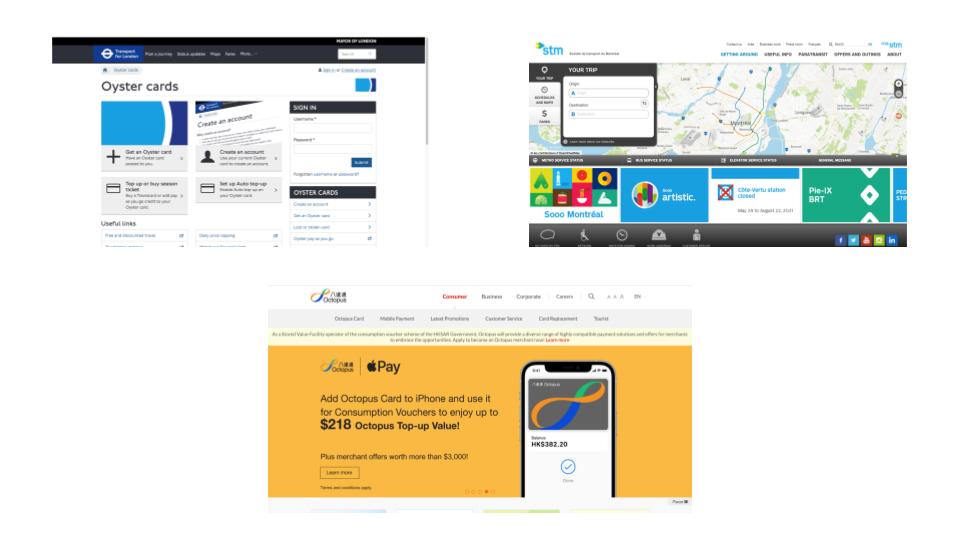
Left to Right: Oyster, STM. Bottom: Octopus
The TTC website in comparison has dense information in small font that is placed in random places. The page explaining PRESTO is off to the side with none of the companies associated branding to give the initial visual cue to the customer. On the PRESTO website there is no mention of the TTC on the homepage.
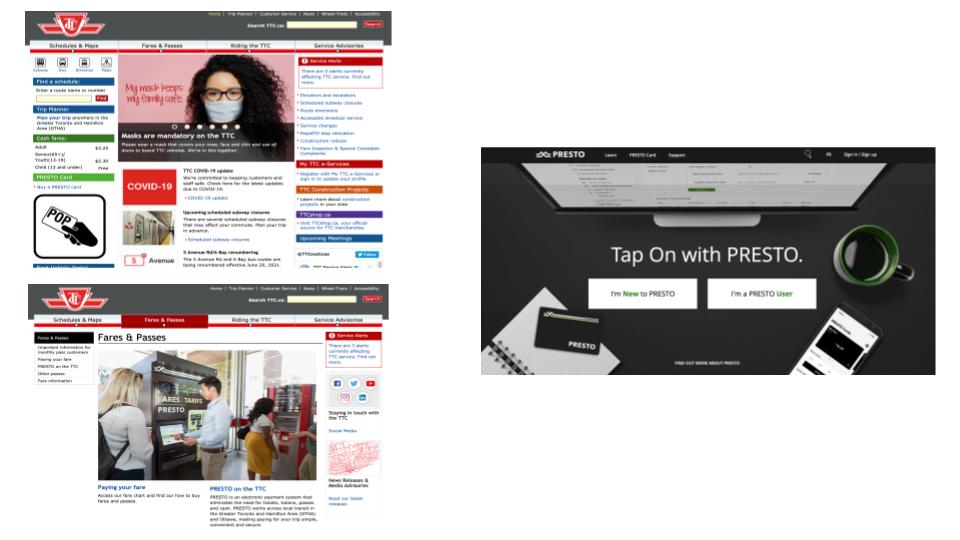
Left to Right: TTC & PRESTO
Comparative Table
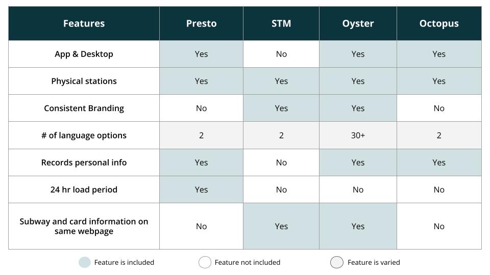
A competitor chart detailing features that are necessary for funcationality, as well as features that users have reported as having high value. Main user base concerns are: consistency of service and reliable when reloading PRESTO cards, user privacy, and customer service support.
Interview Questions
- In your day-to-day life what is the primary method you use to pay for goods and services:
- Physical cards
- Mobile or Digital wallet
- Cash
- Other
- What is your main motivation for using the TTC?
- On average, do you spend more time on a desktop computer or mobile device? Are there certain online tasks that are easier on one type of device than the other?
- Do you have any routine or schedule for when you add funds to your PRESTO card?
- When introduced to a new product or service, how do you like the information to be presented:
- A few keywords
- A video explaining the pertinent points
- Detailed paragraphs of all relevant information
- Pictograms or instruction based illustrations
- Other
- Do you prefer company websites to be written in a professional or friendly tone? Why?
- In your opinion, what colour do you associate with the following words: professional, fun, efficient, economic.
- The most challenging thing about Presto’s services is _________ ?
With these questions I wanted to get a sense of how consumers organise their day-to-day life and what appeals to them most on an intellectual level as well as an emotional one.
Results
- Physical cards
- I do not use the TTC anymore
- Mobile device; easier to send emails and fill out forms on laptop but everything else is easier on my phone
- No, just top up presto when it runs out of funds (which is fairly infrequently)
- Pictograms, or a combination or pictograms and a few keywords
- I prefer company websites to be written professionally; a friendly tone implies a closer relationship, which I do not have with any business or corporation. Corporations are not friends.
- Professional: black, grey, or white; fun: yellow; efficient: red; economic: green
- The most challenging aspect of PRESTO's service is that there is no warning before you run out of funds. You just have to tap and find out in the moment, and with buses in particular, it’s not possible to reload once you’re already on the bus.
User: Female, 31, working professional
- Digital Wallet
- I use the TTC when other forms of transportation are unavailable.
- I spend more time on a mobile device. Typing as well as visual tasks that require larger screen space are easier on a computer.
- My PRESTO card is on autoload once it reaches below $20.
- E - a combination of option B along with a link to a page with option C
- I prefer a professional tone because no company is a monolith, and because of this, there is no possible way for a company to have a disposition towards its customers outside of its desired public relation strategy. What a friendly nature manifests as is also somewhat subjective and cultural. Residing in Canada, many businesses mimic the politeness of Canadian culture as friendliness, which inhibits genuine kindness.
- professional - black, fun - yellow, efficient - green, economic - red
- Company transparency and visibility could be increased. I use the PRESTO card because it is what the city wants us to use to take public transit, but I have no faith in the company as a whole.
User: Male, 28, working professional
- A. Physical cards
- To travel within the city.
- Computer. Anything with typing easier on a computer.
- I just reload whenever the card runs out of funds.
- C or D.
- No preference
- Blue
- No opinion
User: Male, 35, working professional
- Physical cards
- To travel to appointments
- Mobile phone. Much easier to perform tasks that require larger screen size such as reading and comparing information.
- When it appears my card is low.
- A few words and pictograms
- An in-between of profession and friendly
- professional = black, fun= yellow, efficient= blue, economic= green
- There’s support systems in place but still being physically at the station is the most convenient way to use PRESTO
User: Female, 32, student
Insights
From the demographic data and questionnaire the insights gathered are that the primary users of the TTC and PRESTO are people who are starting off in their careers or entry to the workforce, low income bracket, and women (who are more likely to experience a wage gap, earning 67 cents to every dollar their male counterparts will earn), and workers who live outside downtown core and commute into Toronto.
Satisfaction seems to be low amongst people who use the TTC often, rather than those who use it infrequently. Marginalised community members are more likely to have a poor experience when dealing with the TTC than privileged counter parts.
Financial satisfaction and geographical location of the users home seems to play a part in whether user's decide to use the TTC or not. Those who can afford a car will choose driving over the TTC.
There is a sense of frustration that comes with the PRESTO experience, where users feel that they are forced to use and support a company they do not agree with their ethics, service provided, and the cost that they are charged to use a service that they feel does not have their best interest in mind. There is no alternative public transit available so there is little alternative choice for PRESTO’s current demographic to find an affordable way to commute.
Personas
Callum

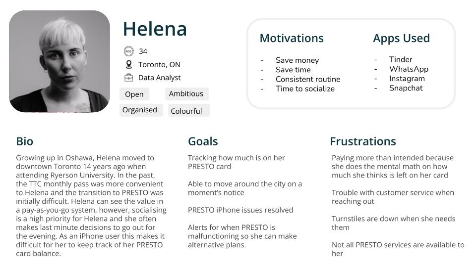
Helena
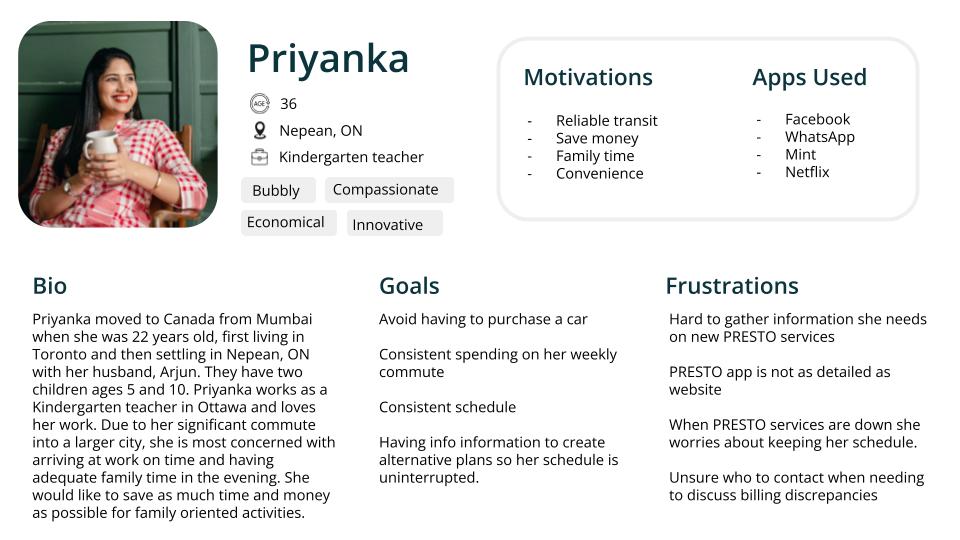
Priyanka
Use Cases
User Story
At the beginning of the month Callum secures a gallery booking for his oil painting based series on various regional birds. In order to pay for materials needed to ready his show, he is working double time at his BMO call centre job. The night before the grand reception of the show, Callum is late leaving work and realises that he hadn’t checked his PRESTO card balance on the PRESTO website before leaving the office for his streetcar stop. As a iPhone user, he knows that whatever funds on his card will not be accurately reflected on the app, and that the only way for him to check and update his balance is to go to the nearest subway stop and check the card at a PRESTO station. He needs to make it to the gallery to add the last touches to his gallery show, and may not have enough time to do so with this detour.
Use Case
- Checks his phone clock to calculate how how much time he has
- Opens Google Maps to determine if it is quicker to walk to the nearest subway station or back to his office
- Enters the directions to the two location from his current location
- The office is closer
- Starts walking back to the office
- Pulls out office keycard
- Enters building
- Logs into work computer
- Goes to prestocard.ca
- Logs into his account
- Sees that his card is low and he will not have enough funds for his transit tomorrow
- Gets out his wallet
- Finds his credit card
- Enters his credit card information
- Hits “enter”
- Logs out of his account
- Leaves the office
- Gets on the streetcar
Unknown Elements
Currently PRESTO is updating some of their website functionality and have listed features such as "Report Lost Card" and "Transaction History". These are good first steps towards giving the customer more control over their PRESTO experience, but there seems to be no plans to tackle some of the bigger issues such as the 24 hour load time. This long period of time between account updates was a thing highlighted by Metrolinx as an issue back in 2018 but has yet to be tackled by the company. Currently, there is no data on how much funding Metrolinx has available to them for branding and advertisement that could work towards a more cohesive look with TTC or if there is a larger branding stragedy in the works.
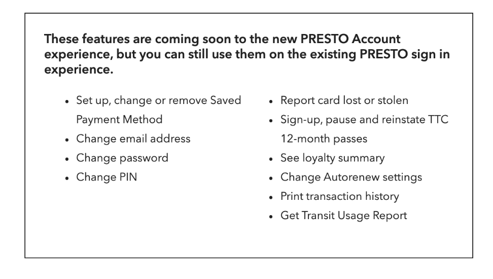
Early 2020s list of features that are on Metrolinx's roadmap for upcoming updates.
Assumptions
Although customer satisfaction is rated high in Metrolinx’s priorities, I believe that because the company has fallen short to meet project and financial goals to TTC backers that customer satisfaction ranks very low on the company’s current priority list until they can fulfill their original contract. The PRESTO website has a generic template feel and does not give the impression that it was created specifically with a transit system in mind. At this point in time, I think customer’s regard PRESTO as a profit focused company and do not feel they are supported as users.
Solution
The Solution
I believe revisting the digital points of contact for TTC, PRESTO website, and PRESTO app would be immensely helpful in communicating a more user-focused stragedy to PRESTO's user base. These three digital spaves should to feel like they are part of the same package and have the same functionality. PRESTO would also greatly benefit from reduced loading times for funds and have better transparency with customers about possible issues they might encounter and the means in which they can solve them. Having a more involved onboarding process that will walk people through the sign-up card process, add funds, and where they can find TTC information should be available on an easy to locate landing page, such as a dashboard.
Why is it better?
Having the information broken down into visuals will makes the customer feel like it is easier to comprehend and gives them clues on where to direct their attention next rather than an involved accordion menu FAQ. Especially for users who may not speak English as their first language. In 2020, PRESTO has a reputation for poor customer service, if Metrolinx revisits their original goals and strives for a better customer service then it is possible they will avoid further revenue loss as more customers will be willing to invest time and money into the PRESTO system.
Wireframes
Information Architecture
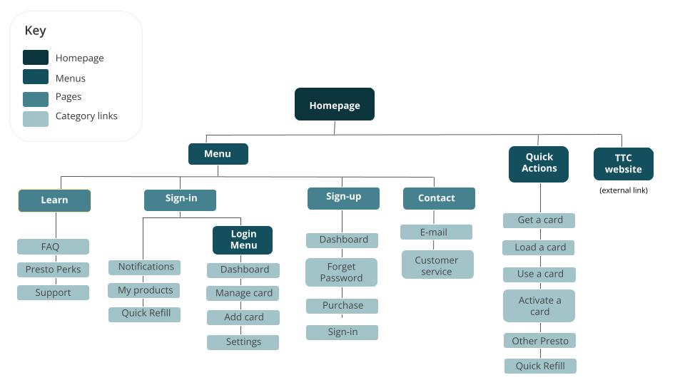
Sketches
Insights
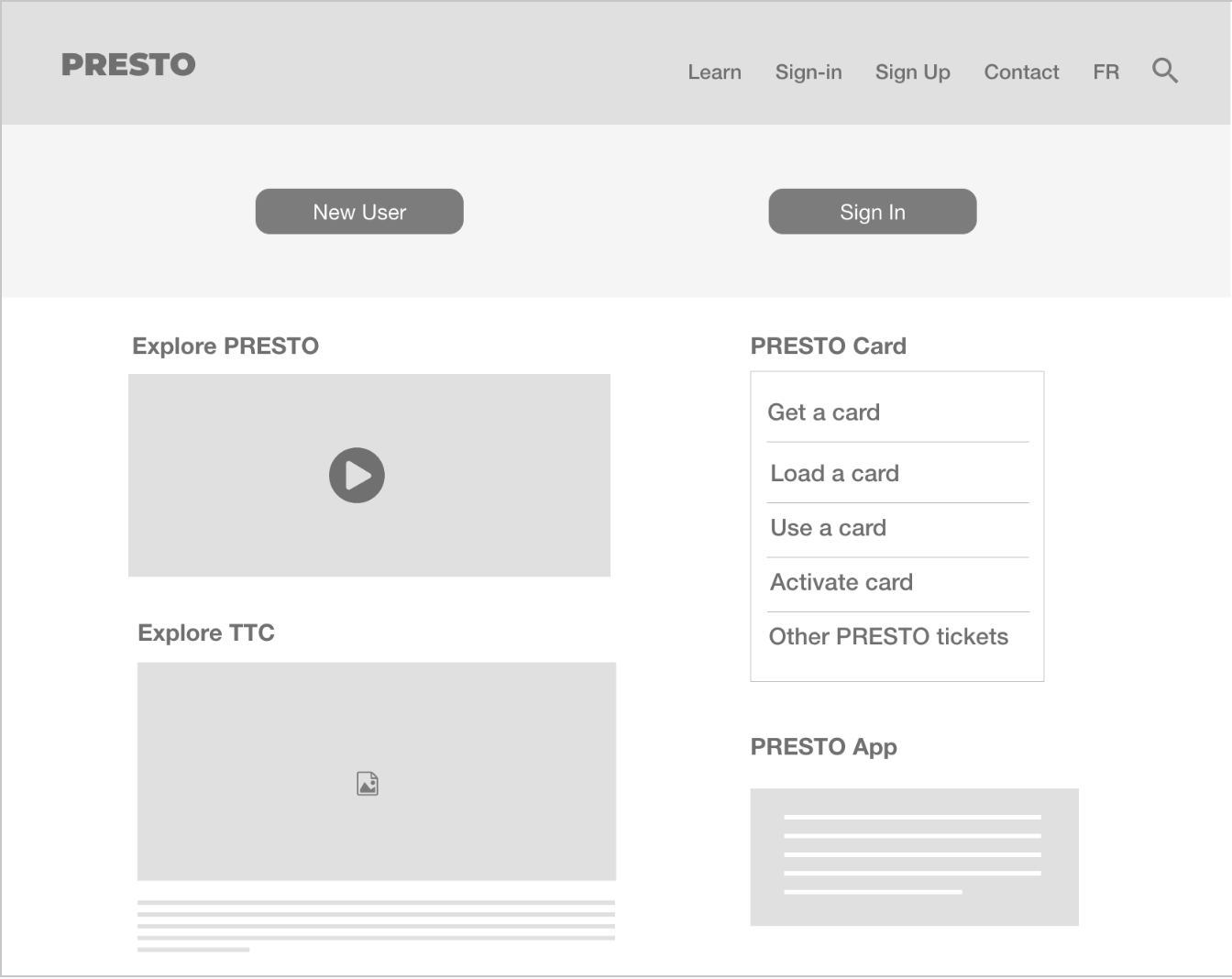
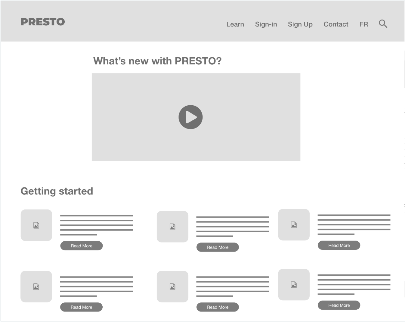
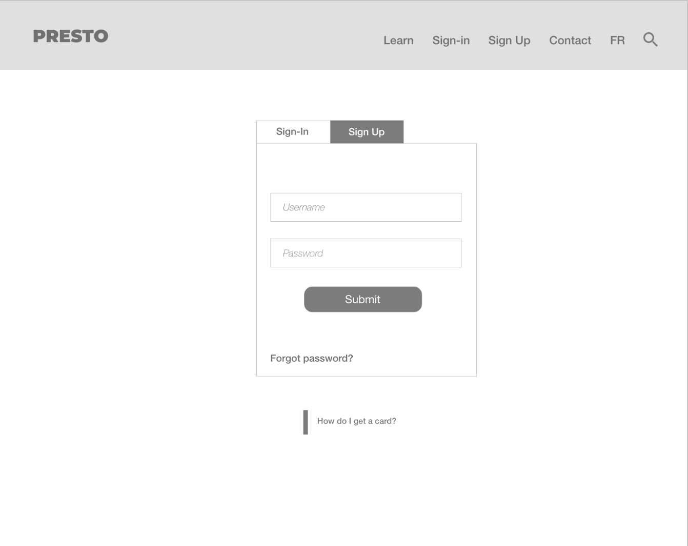
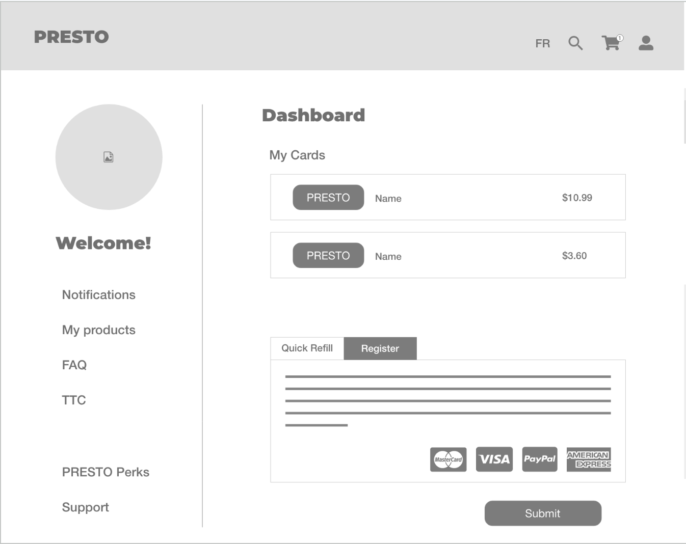
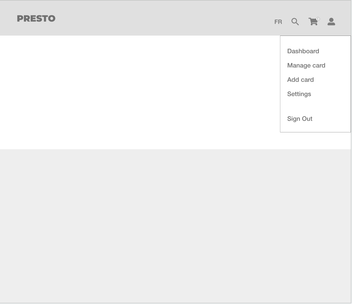
The wireframes cover the onboarding experience to integrate the TTC as well as a more streamline compact website.
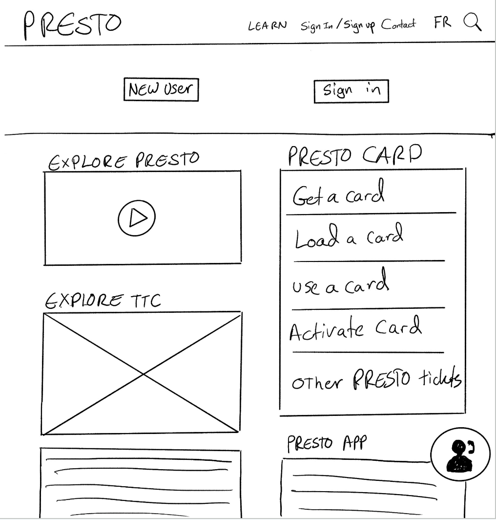
The PRESTO header is mostly unchanged as well as the login banner. There would be a video to play that will explain to the user the new changes and some pertinent points about the new layout changes. PRESTO questions are broken down to the right as well as a link to download the app. To the left will be a image header and some text explaining the TTC and how PRESTO users can ride it.
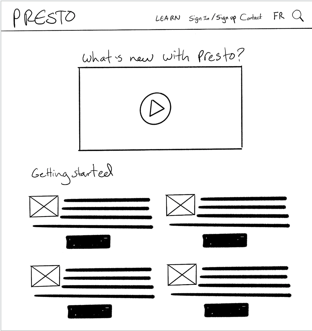
Learn section has the same onboarding video as well as the frequently asked PRESTO questions broken down with eye catching pictograms.
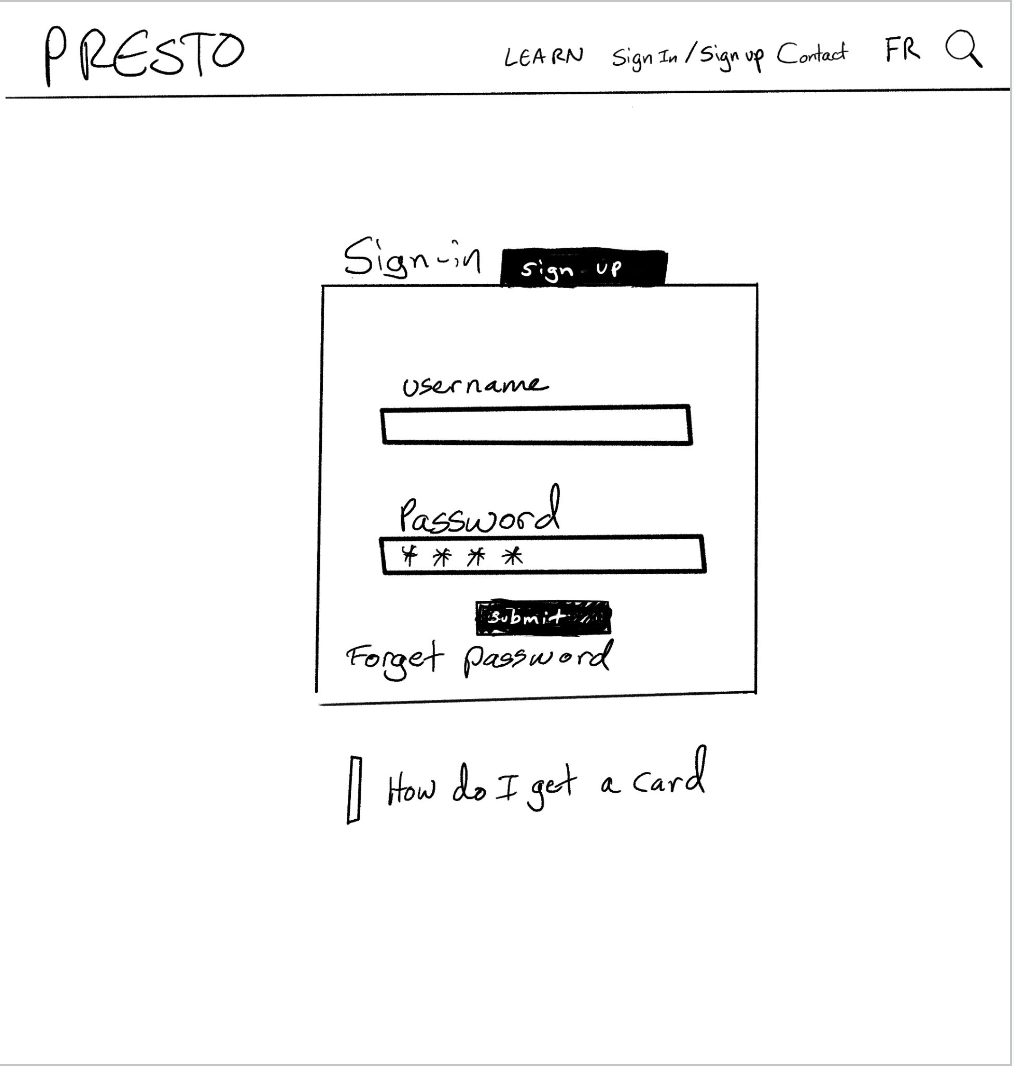
Sign in page is condensed to one form. The tab at the top will give the user the option to register. Underneath is a simple link, directing any user's with onboarding questions to a page detailing the process.
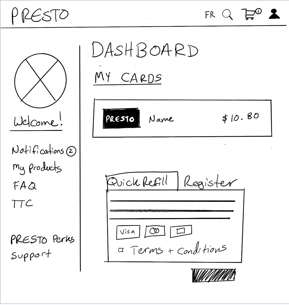
The dashboard is much the same, but instead of having a header with multiple call to actions, some of the links have been moved down into a side bar. The "quick refill" feature is prominent so users do not have to navigate further into the website/app architecture to find this action.
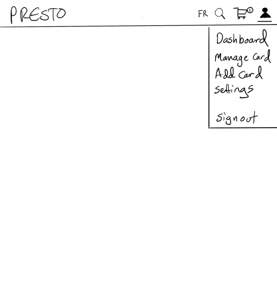
The profile menu that appears when you log in now has menu items of “most used” functionality based on metrics of what features user's most interact with.
Lo-Fi Wireframes
What's Next?
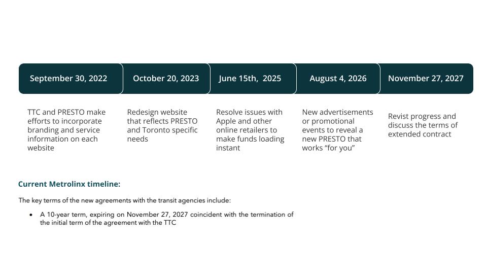
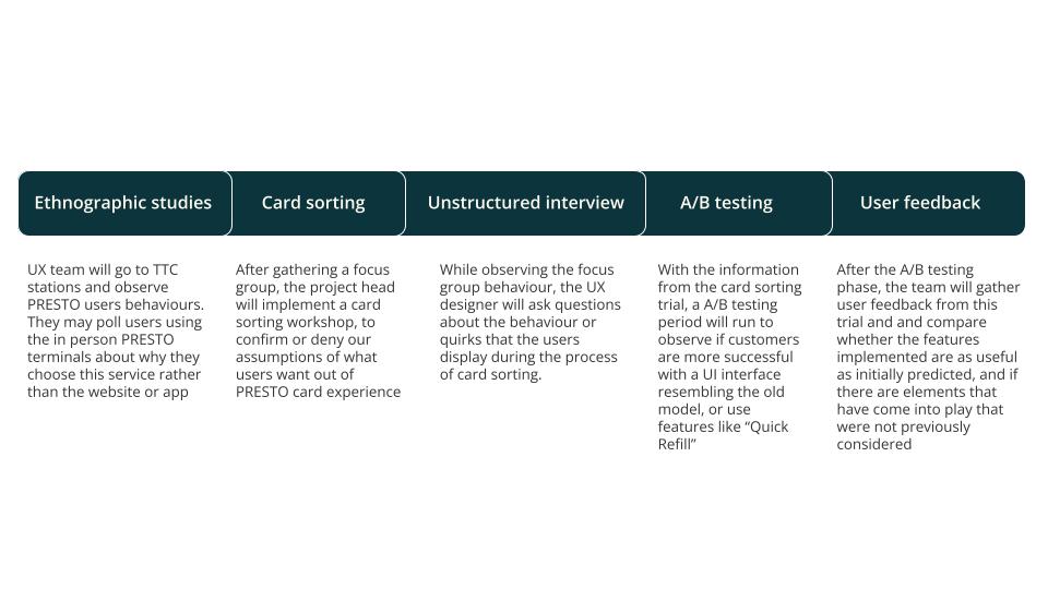
The hypothetical breakdown of the timeline and Testing Plan, to bring the outlined project changes to the finish line.
Timeline
User Testing Plan
Design System
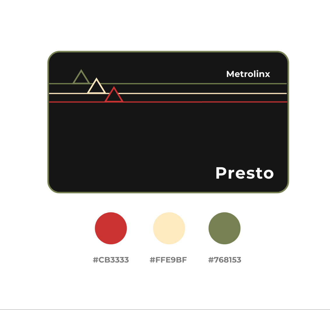
A mock up of changes that could be implemented into PRESTO's branding to make a more clear and pronounced association with TTC branding to help with the general disonnect between the two companies identies.
Moodboard

Branding
Citations
https://www.torontoauditor.ca/report/review-of-toronto-transit-commissions-revenue-operations-phase-two-presto-ttc-fare-equipment-and-presto-revenue
https://blog.metrolinx.com/2020/09/29/new-to-nfc-with-the-presto-app-here-are-some-pro-tips
https://www.blogto.com/city/2019/01/worst-things-about-presto
https://en.wikipedia.org/wiki/Presto_card
https://www.ttc.ca/About_the_TTC/Commission_reports_and_information/Commission_meetings/2019
http://www.metrolinx.com/en/aboutus/publications/2018-19-Metrolinx-Business-Plan-DRAFT.pdf
https://www.iheartradio.ca/newstalk-1010/news/poll-public-transit-and-the-ttc-1.3349571
https://www.thestar.com/news/gta/2019/02/01/metrolinx-continues-to-share-presto-users-data-without-requiring-warrants.html
https://canadianwomen.org/the-facts/the-gender-pay-gap